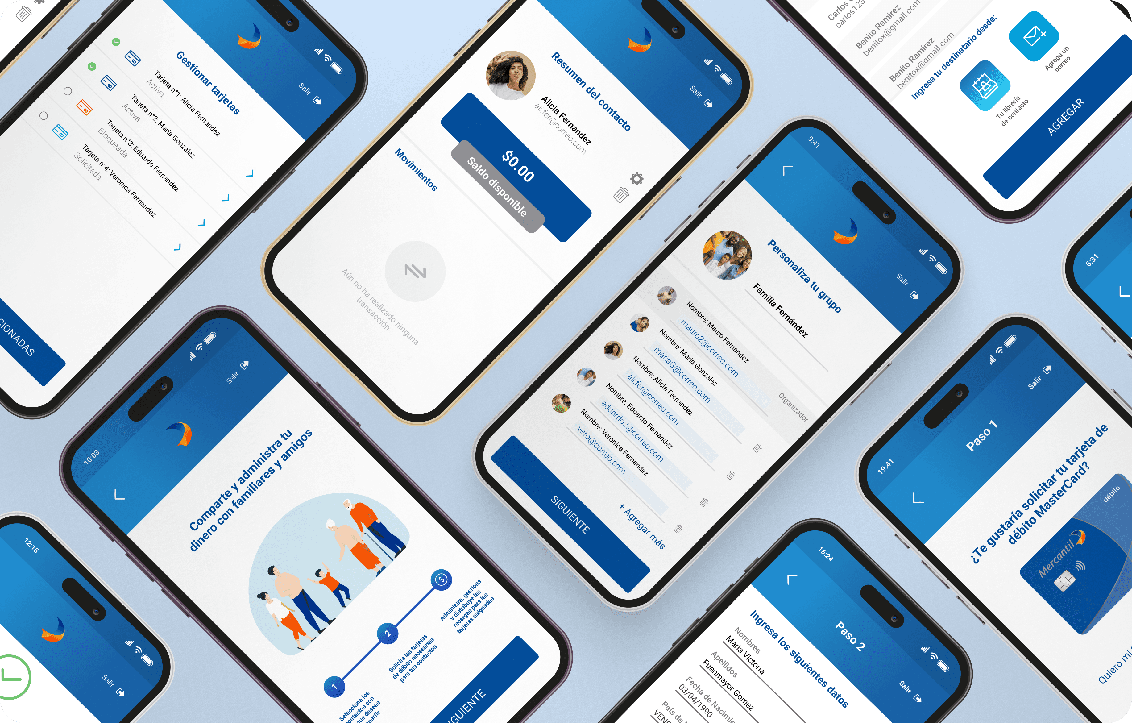


El diseño final no solo superó estos desafíos, sino que también proporcionó una experiencia fluida, segura y fácil de usar para todos los miembros de la familia.
Simplificando las Finanzas Familiares
Simplificando las Finanzas Familiares
Imagina una forma fluida de gestionar las finanzas de toda tu familia, todo bajo una sola cuenta, con un único administrador supervisando todo. Este proyecto tenía como objetivo crear tal cuenta, que centraliza las transacciones familiares, haciéndolas fáciles, rápidas y seguras.
Imagina una forma fluida de gestionar las finanzas de toda tu familia, todo bajo una sola cuenta, con un único administrador supervisando todo. Este proyecto tenía como objetivo crear tal cuenta, que centraliza las transacciones familiares, haciéndolas fáciles, rápidas y seguras.
Cliente
Cliente
Mercantil Panamá
Mi rol
Diseñador/a UX/UI
Diseño de UI, Diseño de UX, Prototipo, Diseño de aplicaciones, Diseño móvil
Diseño de UI, Diseño de UX, Prototipo, Diseño de aplicaciones, Diseño móvil
Diseño de UI, Diseño de UX, Prototipo, Diseño de aplicaciones, Diseño móvil
Categoría
El Desafío
El Desafío
Legality:
Given the nature of the account, it could only be related to one person, and any illegal activity carried out by any of the participants related to the main account could damage their reputation. It was necessary to create automatic ways to report any suspicious behavior, and have several security measures during the configuration process. As well as managing access for minors/under age.
Performance:
Two interfaces with different behaviors would need to be designed, one for the account administrator and other for the recipients, but both will connect automatically and receive updates, notifications and news/updates at the same time.
Accessibility:
In order to manage the account, it was necessary to deliver cards to the beneficiaries, so it was necessary to collect data and limit the number of cards that can be issued.
Resumen de la investigación
Resumen de la investigación
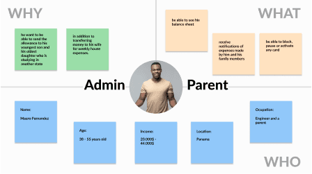
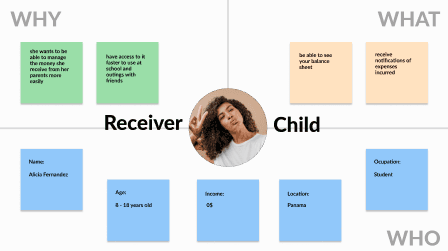
Understanding our users was key to delivering a solution that truly resonates. By analyzing customer data, I identified two distinct user groups, each with unique characteristics and needs. This research laid the foundation for designing a feature that caters precisely to our users' expectations.
Understanding our users was key to delivering a solution that truly resonates. By analyzing customer data, I identified two distinct user groups, each with unique characteristics and needs. This research laid the foundation for designing a feature that caters precisely to our users' expectations.
With a clear understanding of user needs, I mapped out the entire feature using a flow diagram. This visual tool not only clarified the project's scope but also helped anticipate potential issues early in the development process.
With a clear understanding of user needs, I mapped out the entire feature using a flow diagram. This visual tool not only clarified the project's scope but also helped anticipate potential issues early in the development process.


Before diving into the design, I collaborated with the team to create a moodboard that captured the functional and aesthetic references for the feature. This, combined with our storyboards, guided the creation of a low-fidelity prototype, ready to be presented to the board of directors.
Before diving into the design, I collaborated with the team to create a moodboard that captured the functional and aesthetic references for the feature. This, combined with our storyboards, guided the creation of a low-fidelity prototype, ready to be presented to the board of directors.
Conceptualización: De Ideas a Soluciones
Conceptualización: De Ideas a Soluciones
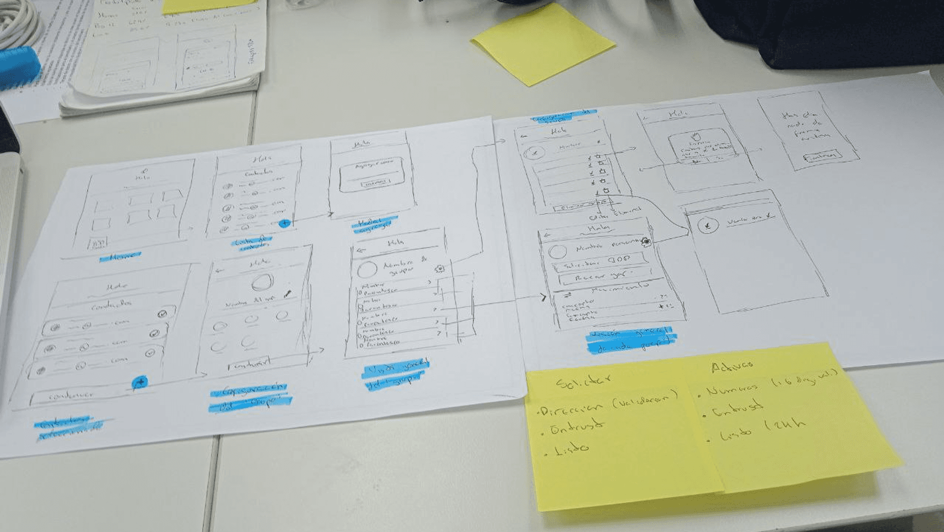
Armed with insights, I began sketching storyboards to visualize the full spectrum of challenges and brainstorm potential solutions. These sketches revealed the complexities of card management, underscoring the need for a simplified, user-friendly process. By refining the customer experience at this stage, I ensured that the final design would be both intuitive and effective.
Armed with insights, I began sketching storyboards to visualize the full spectrum of challenges and brainstorm potential solutions. These sketches revealed the complexities of card management, underscoring the need for a simplified, user-friendly process. By refining the customer experience at this stage, I ensured that the final design would be both intuitive and effective.
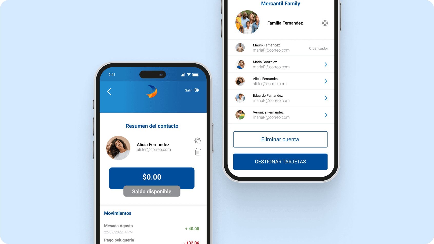


Diseño de interfaz de usuario
After a thorough and iterative design process, we arrived at a solution that answered the critical questions:
How can multiple cards be efficiently managed by a single administrator?
How can the movements of several users be tracked securely?
What measures ensure the feature’s safety and reliability?
