Wireframes also explored how to best present the patent details in a way that minimized visual clutter and allowed users to digest information quickly.
Wireframes also explored how to best present the patent details in a way that minimized visual clutter and allowed users to digest information quickly.
Mockups:
Once the wireframes were finalized, high-fidelity mockups were created using Figma, incorporating:
A modern, minimalist design with a focus on whitespace to improve readability.
Color coding for patent statuses (e.g., active, pending, expired) to make it easy for users to differentiate at a glance.
Consistent typography for a professional, clean feel that enhanced the user experience.


Reimagining Patent Search
Reimagining Patent Search
Despite housing a vast database of technological patents, users found it difficult to navigate the platform due to an outdated interface and complex search functionalities. The primary goal was to simplify the platform, making it visually cleaner, more accessible, and easier for users to find and explore relevant patents.
Despite housing a vast database of technological patents, users found it difficult to navigate the platform due to an outdated interface and complex search functionalities. The primary goal was to simplify the platform, making it visually cleaner, more accessible, and easier for users to find and explore relevant patents.
Client
GetFocus
My Role
UX/UI Designer
UI Design, UX Design, Prototype, Web Design, Accessibility
Category
Primary research
Primary research
Business Challenges:
Despite having a rich database of patents, was experiencing declining user engagement due to its overly complex interface. Users, ranging from researchers to legal professionals, reported frustration with search difficulties and irrelevant results, leading to lower user retention and missed opportunities for monetization.
The business challenges included:
Ensure a user-friendly platform due to the nature and amount of information that must be provided.
Guarantee personalization when searching.
Ensure a good responsive experience.
User Needs:
Understanding the diverse needs of the platform’s users was essential for shaping the redesign. The user who required a fast, reliable, and intuitive way to search for patents.
Key user needs identified:
Users tend to scan web pages in an 'F' pattern, the layout of the search bar and filter options should be designed to align with these natural reading patterns.
Users need to be able to make quick decisions so filters should not be overwhelming for them.
Users need the option to have their information on any platform in an efficient and simple way.
Competitor Analysis:
Before diving into the redesign, I conducted a competitor analysis to identify best practices and gaps in the market. Platforms such as Google Patents and PatSnap were thoroughly analyzed.
Google Patents: Offered a clean, minimalistic design with simple search filters, but lacked advanced features for professionals like customizable search parameters.
Clarivate Analytics: Provides in-depth analysis and comprehensive patent information and includes powerful tools for patent mapping, citation analysis, and competitive intelligence. but Subscription can be expensive, which may not be suitable for all users and had a steep learning curve due to the advanced features and extensive data available.
Through the research I gained several important insights that shaped the design approach:
Users want control over their search experience: Flexibility to apply multiple filters without overwhelming complexity is essential.
Visual overload leads to frustration: A clean, minimal design helps users focus on the task at hand.
Mobile usability cannot be an afterthought: Many professionals expect to access the platform across devices seamlessly.
User Personas
User Personas
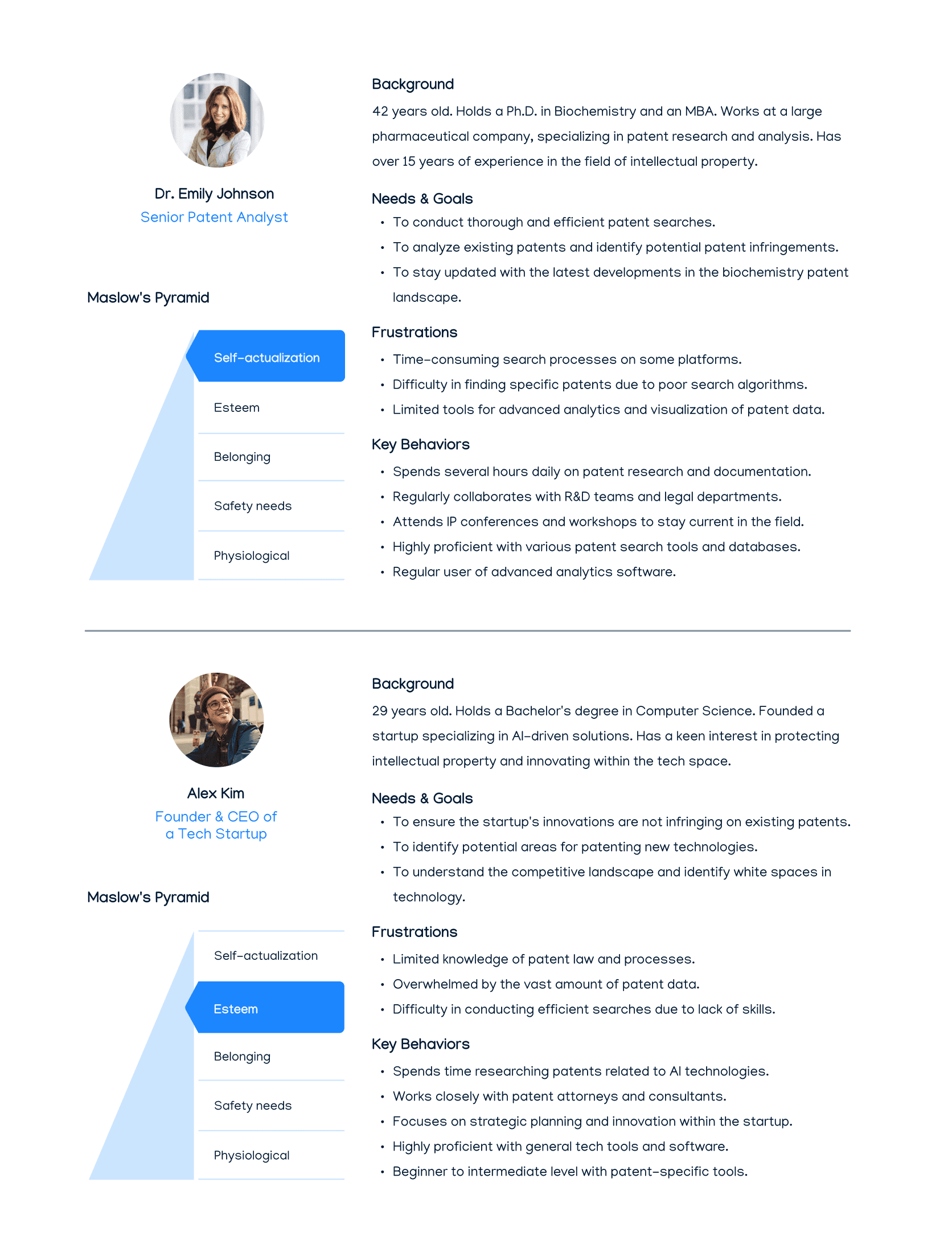
Based on research, two primary user personas were created to represent the core audience:
Based on research, two primary user personas were created to represent the core audience:
Bringing Ideas to Life
Bringing Ideas to Life
Sketches & Wireframes:
Began with low-fidelity sketches to brainstorm different layout options, focusing on keeping the interface clean and minimal. These sketches evolved into wireframes.
Sketches & Wireframes:
Began with low-fidelity sketches to brainstorm different layout options, focusing on keeping the interface clean and minimal. These sketches evolved into wireframes.
Accessibility Analysis
Accessibility Analysis
Accessibility was a key focus during the redesign of the Get Focus platform. To ensure all users, including those with disabilities, could effectively navigate and use the platform, several accessibility features were integrated. I utilized the Stark plugin in Figma to ensure color contrast ratios met the WCAG (Web Content Accessibility Guidelines) standards, making text more readable for users with visual impairments.
Accessibility was a key focus during the redesign of the Get Focus platform. To ensure all users, including those with disabilities, could effectively navigate and use the platform, several accessibility features were integrated. I utilized the Stark plugin in Figma to ensure color contrast ratios met the WCAG (Web Content Accessibility Guidelines) standards, making text more readable for users with visual impairments.
Final Design
Final Design
The redesigned Get Focus platform achieved its goal of simplifying the patent search process while improving the overall user experience. By focusing on user needs, reducing complexity, and prioritizing accessibility, the platform now provides a smoother, more intuitive experience for researchers and innovators.
