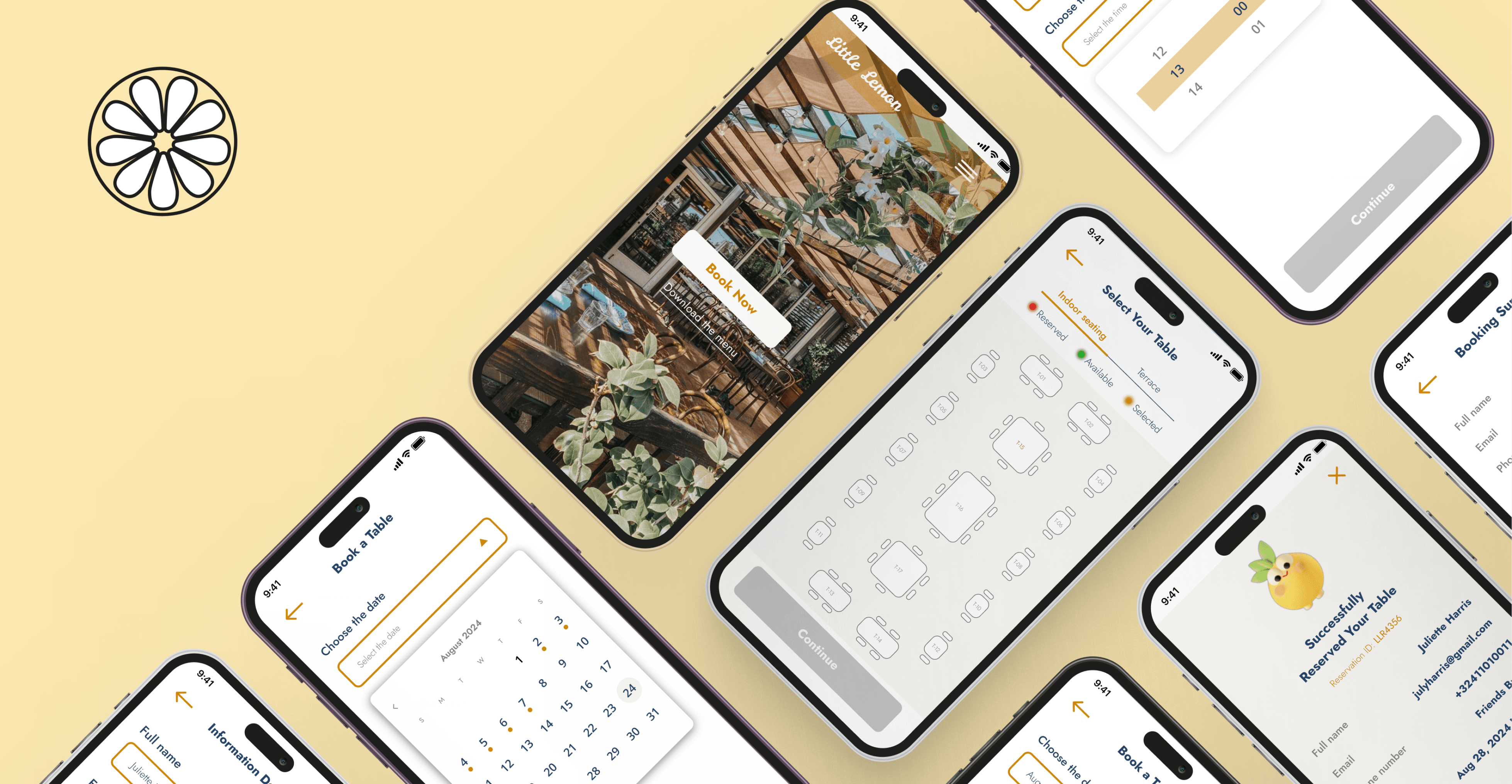




Mockups: Bringing the Vision to Life
For the visual identity, I opted for:
Vibrant, citrus-inspired colors to reflect the fresh, natural flavors of Little Lemon’s menu.
A friendly, modern typography that communicated the restaurant’s warm, approachable atmosphere.
High-quality images of signature dishes and warm, inviting interiors to visually entice visitors.
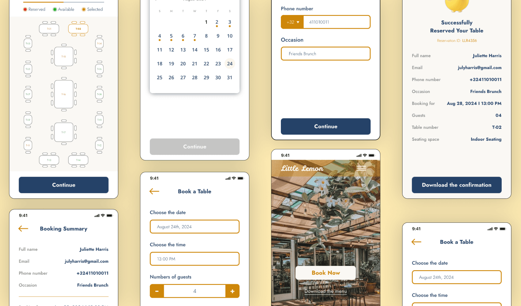
Prototype: Testing the Flow
Using Creatie, I created a the design and prototype to demonstrate the full user journey through the booking process.
Prototype: Testing the Flow
Using Creatie, I created a the design and prototype to demonstrate the full user journey through the booking process.




Optimizing Brunch Reservations
Optimizing Brunch Reservations
A cozy neighborhood restaurant, needed more than just a fresh coat of paint—it sought a full brand revitalization and an overhaul of its table booking process. With the goal of enhancing the customer experience and modernizing its brand identity.
A cozy neighborhood restaurant, needed more than just a fresh coat of paint—it sought a full brand revitalization and an overhaul of its table booking process. With the goal of enhancing the customer experience and modernizing its brand identity.
Client
Little Lemon
My Role
UX/UI Designer
UI Design, UX Design, Prototype, App Design, Mobile Design, Redesign
Category
The Challenge
The Challenge
The restaurant brand had grown stale, with a lack of cohesion between the restaurant’s warm, welcoming atmosphere and its visual identity. On top of that, the existing table booking system was clunky and confusing, leading to frustration among customers and missed opportunities for the restaurant.
The restaurant brand had grown stale, with a lack of cohesion between the restaurant’s warm, welcoming atmosphere and its visual identity. On top of that, the existing table booking system was clunky and confusing, leading to frustration among customers and missed opportunities for the restaurant.
Understanding the Users
Understanding the Users
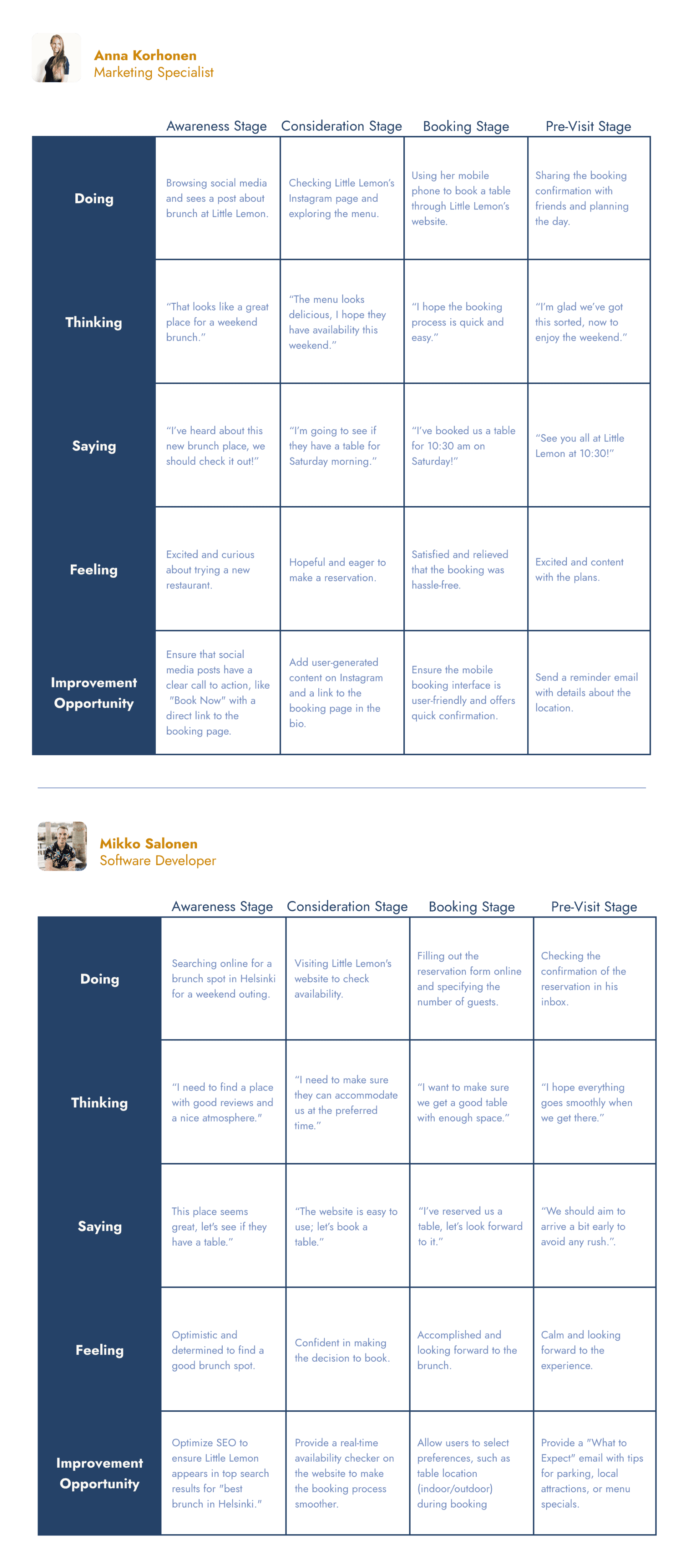
Before diving into the design process, I conducted user research to better understand the needs of Little Lemon’s core customers. I developed two user personas, each representing different customer segments, and mapped out their journeys.
Before diving into the design process, I conducted user research to better understand the needs of Little Lemon’s core customers. I developed two user personas, each representing different customer segments, and mapped out their journeys.
Design Process
Design Process
With clear insights into user pain points and desires, I embarked on redesigning Little Lemon’s brand and booking system, focusing on ease of use and visual appeal.
With clear insights into user pain points and desires, I embarked on redesigning Little Lemon’s brand and booking system, focusing on ease of use and visual appeal.
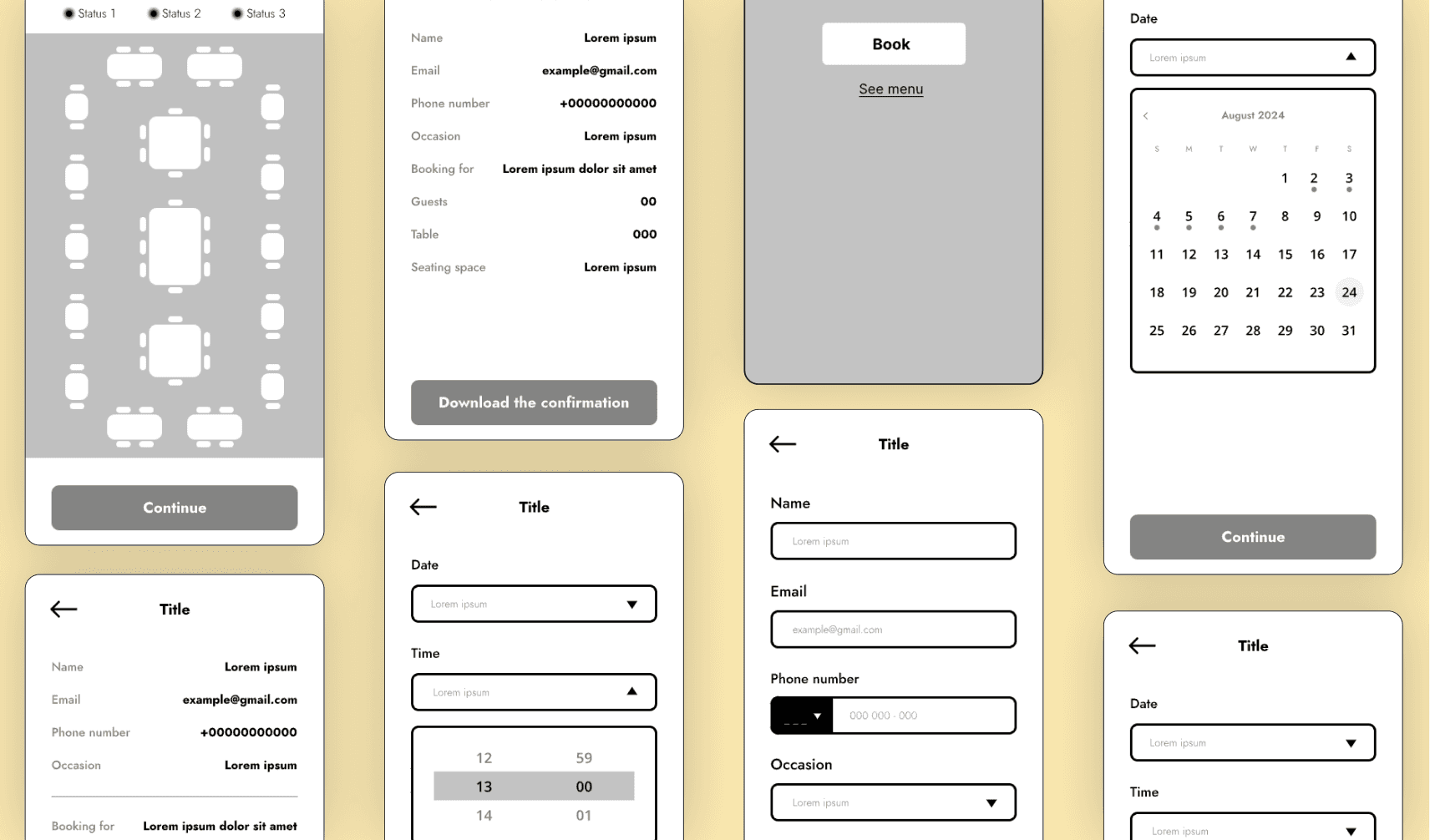
Wireframes: Laying the Foundation
The wireframes focused on simplifying the reservation process while improving the overall layout. Key features included:
Clear call-to-action buttons for booking tables.
A real-time table availability display to give users instant feedback.
An intuitive step-by-step reservation process, minimizing the number of screens users had to navigate.
Final Design
Final Design
Through a user-centered approach, I was able to address the core issues facing Little Lemon’s digital presence. The new brand identity brought a fresh, modern feel to the restaurant, while the revamped booking system improved both user experience and business efficiency. Little Lemon now stands as a perfect example of how thoughtful UX/UI design can transform not only the customer experience but also the overall success of a restaurant.
