Wireframing:
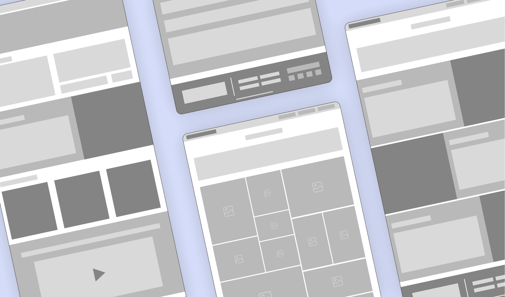
Once the structure was mapped, I designed wireframes to define the layout and key elements of each page, ensuring a smooth user journey.
Wireframing:
Once the structure was mapped, I designed wireframes to define the layout and key elements of each page, ensuring a smooth user journey.


From Vision to WordPress Launch
From Vision to WordPress Launch
The goal was to build from branding to a fully functional WordPress website. The process began with a kickoff meeting to understand the team’s vision and ideas, ensuring that every design decision aligned with their goals.
The goal was to build from branding to a fully functional WordPress website. The process began with a kickoff meeting to understand the team’s vision and ideas, ensuring that every design decision aligned with their goals.
Client
Client
T.Maxwell Events
T.Maxwell Events
My Role
UX/UI Designer
UI Design, UX Design, Branding, Web Development
Category
Branding Process
Branding Process
To shape the brand, I focused on the 4 V's: Vision, Values, Voice, and Visuals.
Vision:
“We help you create unforgettable moments.”
Values:
Kindness: We prioritize empathy and support in all client and team interactions.
Excellence: We consistently go beyond expectations to deliver outstanding results.
Loyalty: Our strongest asset is our commitment to our clients.
Adaptability: We solve problems quickly and efficiently, no matter the challenge.
Voice:
“Friendly, approachable, and trustworthy.”
Visuals
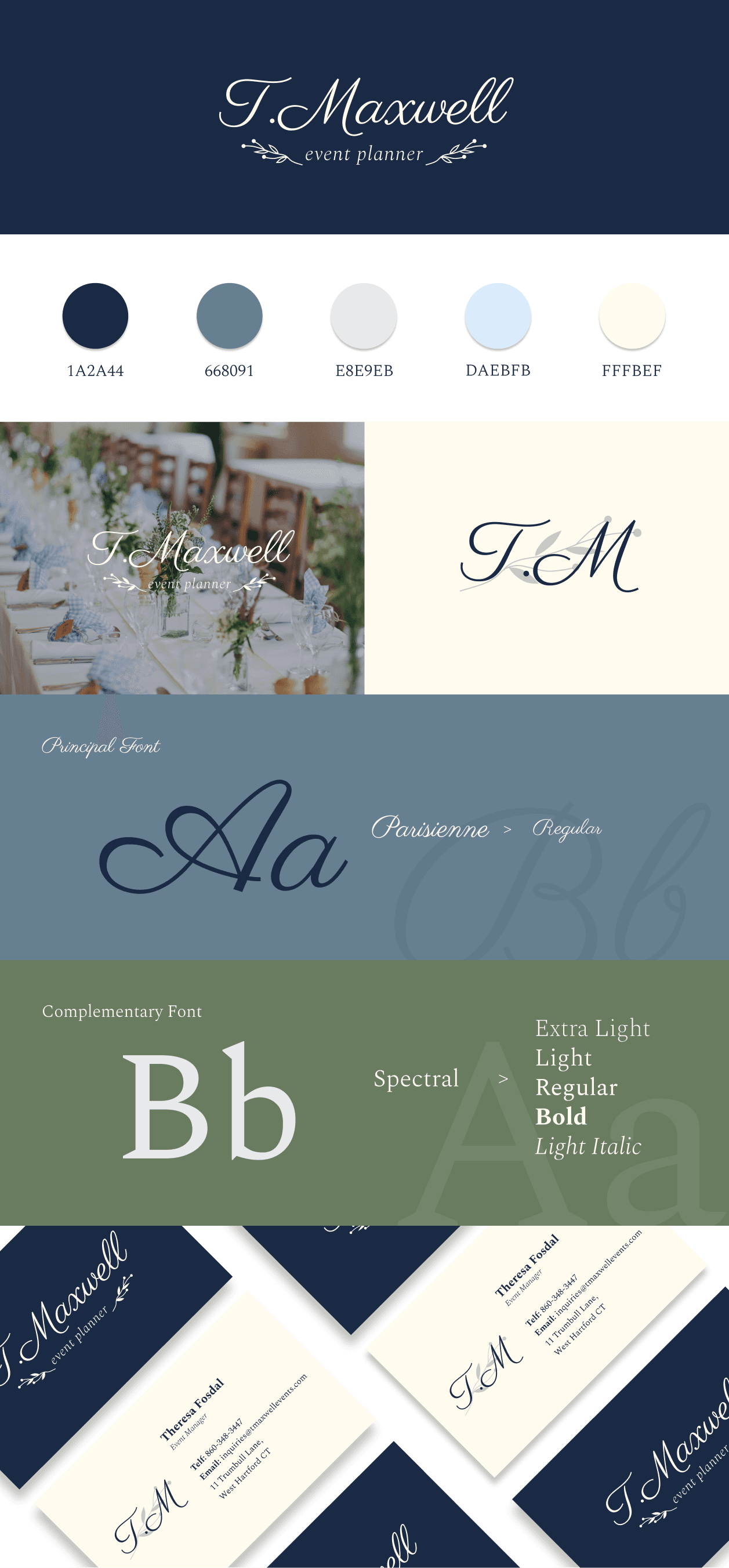
Great design begins with great research. I started by creating a moodboard to gather visual inspiration for:
Logo design.
Color palette.
Typography.
Printed materials.
This research informed the final visual panel, which captures the brand’s aesthetic and identity.
With the brand established, the next step was to bring it to life digitally. The branding process clarified how communicate and who are targeting, but now I had to focus on how users would interact with the website.
Mapping the User Journey:
The first step was to create a website structure that would deliver an intuitive and seamless experience for users.
Website Development
Website Development


WordPress Development:
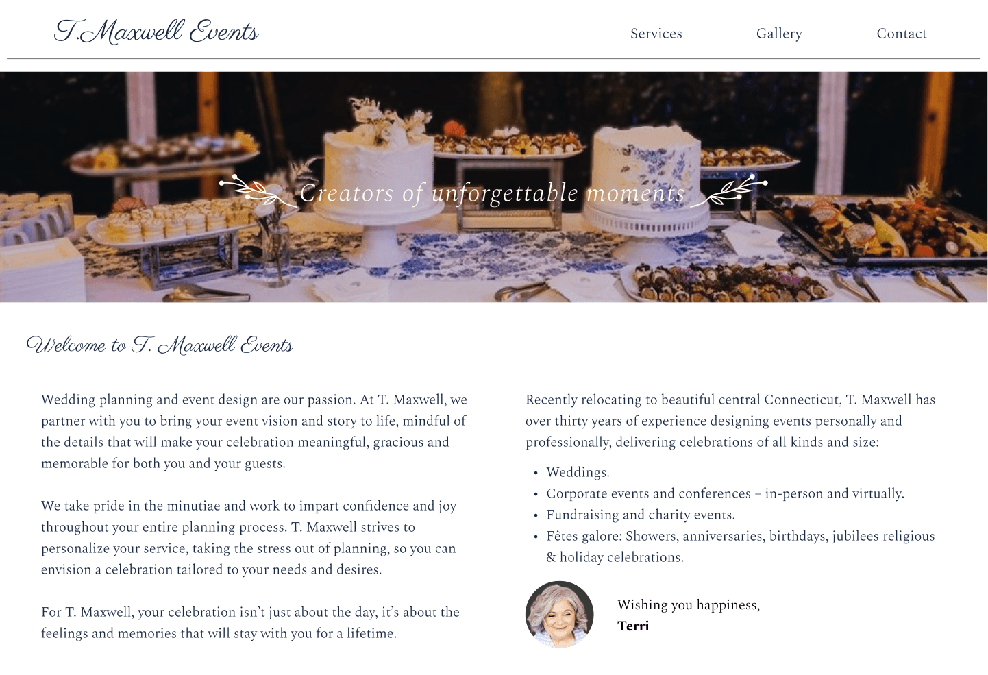
After a few days of development on WordPress, the website was brought to life, fully functional and ready to serve T.Maxwell’s audience.
WordPress Development:
After a few days of development on WordPress, the website was brought to life, fully functional and ready to serve T.Maxwell’s audience.
Final Design
Final Design
From branding to website development, every detail was carefully crafted to provide an intuitive and engaging experience. The completed brand assets, along with the fully functional WordPress website, showcase a cohesive visual identity that aligns with the company’s values. The live website is a testament to how thoughtful design can elevate a brand’s presence and deliver a user-friendly experience for its audience.
UI Design:
With the wireframes approved, it was time to add color and style, integrating the brand’s visual identity into the UI design. Low-fidelity prototypes were created to test the user flow and gather feedback before moving on to the final design.
UI Design:
With the wireframes approved, it was time to add color and style, integrating the brand’s visual identity into the UI design. Low-fidelity prototypes were created to test the user flow and gather feedback before moving on to the final design.
